
Do you want to stand out on Instagram and have your brand instantly recognizable, desirable to follow, and build such a strong presence on Instagram that your followers will associate you with the meaning of your industry?
If so, then you need to get your branding and aesthetics right.
And that’s why I will reveal exactly how to do that in this article. So, are you ready to begin? If so, let’s dive in…
Brand Color Palette

When it comes to establishing strong Instagram branding and aesthetics, one crucial aspect is selecting the right brand color palette. Your choice of colors will define your brand’s visual identity and play a significant role in capturing the attention of your audience.
Let’s dive into a detailed explanation of how you can pick the perfect brand color palette for your Instagram account, with a focus on optimizing it for Instagram branding and aesthetics.
First and foremost, it’s essential to understand your brand identity.
Take some time to reflect on your brand’s values, target audience, and the message you want to convey. Consider whether your brand is playful and fun or professional and sophisticated.
Understanding these aspects will help you choose colors representing your brand’s personality.
Next, delve into color psychology. Colors have psychological associations and can evoke specific emotions. Research the meanings and connotations behind different colors to determine which ones best align with your brand.
For instance, blue can convey trust and reliability, while red can evoke excitement or urgency. Think about how you want your audience to feel when they interact with your brand and choose colors accordingly.
Remember to consider your target audience as well. Instagram has a diverse user base, and it’s crucial to understand your audience’s preferences and demographics. Research their age group, cultural background, and preferences.
Certain colors may resonate better with specific demographics. Vibrant colors might appeal to a younger audience, while muted tones might attract a more mature demographic.
Analyzing your competitors can provide valuable insights as well. Take a look at other Instagram accounts within your industry and examine their color palettes.
While you don’t want to copy them directly, analyzing their choices can give you ideas and help you identify common color themes within your industry. Find ways to differentiate your brand while maintaining a consistent visual appeal.
Consistency is key when it comes to building brand recognition. If you already have established branding elements like a logo or website, consider incorporating the colors from those elements into your Instagram color palette.
This will create a cohesive and recognizable brand identity across different platforms.
Legibility is another crucial factor to consider. Since Instagram is a visual platform, it’s essential to ensure that your chosen color palette doesn’t compromise the legibility of your content. Test your color choices by applying them to sample posts and evaluate how easily the text stands out against the background.
Aim for high contrast between the text and the background to ensure readability.
While it may be tempting to use a wide range of colors, it’s generally advisable to limit your color palette. Having too many colors can create visual chaos and detract from the overall aesthetic.
Select two to four main colors and use them consistently throughout your Instagram feed. Having a smaller color palette will make your content visually cohesive and more visually appealing.
Experimentation and iteration are key to finding the perfect color palette. Don’t be afraid to test different color combinations and solicit feedback from your audience. Monitor the engagement and response to different posts to determine which color choices resonate the most with your audience.
Consider incorporating seasonal or trending colors into your brand color palette to stay fresh and relevant. However, be cautious not to rely too heavily on fleeting trends, as they can quickly become outdated.
Find a balance between timeless colors that reflect your brand identity and incorporating trendy elements when appropriate.
Lastly, it’s essential to document your color palette for easy reference. Create a brand style guide or a document that includes the exact color codes (hex or RGB values) for each color. This will ensure consistency across different design elements and make it easier for you and your team to create cohesive content.
Find Your Own Style

Having your own branded style on Instagram is really important because it helps you stand out from the crowd.
With millions of accounts on the platform, you want to create a unique identity that sets you apart. When you have a distinctive branded style, people will recognize your content instantly and remember you among the sea of other accounts.
Your branded style also plays a crucial role in shaping your brand identity. It’s an extension of your overall brand image, values, and message.
When you maintain a consistent style, it helps to convey a cohesive narrative and reinforce your brand’s identity. This consistency builds familiarity and trust with your audience.
A well-defined branded style brings visual cohesion to your Instagram feed. It ensures that your posts flow seamlessly and create a visually appealing experience for your followers. When someone visits your profile, they should see a cohesive theme or color palette that ties your content together.
This visual harmony enhances the overall aesthetic appeal of your feed, making it more captivating and engaging.
Moreover, finding your own branded style helps you attract and connect with your target audience. Your style should resonate with their preferences and tastes. By understanding your audience’s demographics, interests, and aspirations, you can tailor your visual elements to capture their attention and create content that speaks directly to them.
Now, let’s talk about how you can discover your own branded style on Instagram.
Start by researching successful accounts in your niche or industry. Look at the visual elements they use, such as color schemes, filters, composition, and overall aesthetic. While you shouldn’t copy them directly, this research will provide inspiration and help you understand the visual trends within your field.
Next, define your brand. Clarify your brand’s identity, values, and target audience. Think about what makes you unique and how you want to be perceived. Determine the emotions or messages you want your branded style to convey. Understanding your brand at its core will guide your style choices.
Experiment with different visual elements to see what resonates with you and your brand. Try out different filters, color palettes, compositions, and typography.
See what aligns best with your vision and feels authentic to your brand.
Consistency is key once you’ve found a style that resonates with you. Apply your branded style consistently across your entire feed. Use similar editing techniques, filters, or color grading to maintain visual coherence.
Consistency helps your audience recognize and connect with your content more easily.
Remember to iterate and evolve over time. Analyze the engagement and feedback from your audience to identify what works best. Adapt your style to stay fresh and relevant while maintaining the core elements that make it unique.
Lastly, be authentic…
Stay true to your brand and identity. While it’s important to be aware of trends, don’t chase them blindly if they don’t align with your brand. Strive for a style that is uniquely yours and resonates genuinely with your audience.
Typography
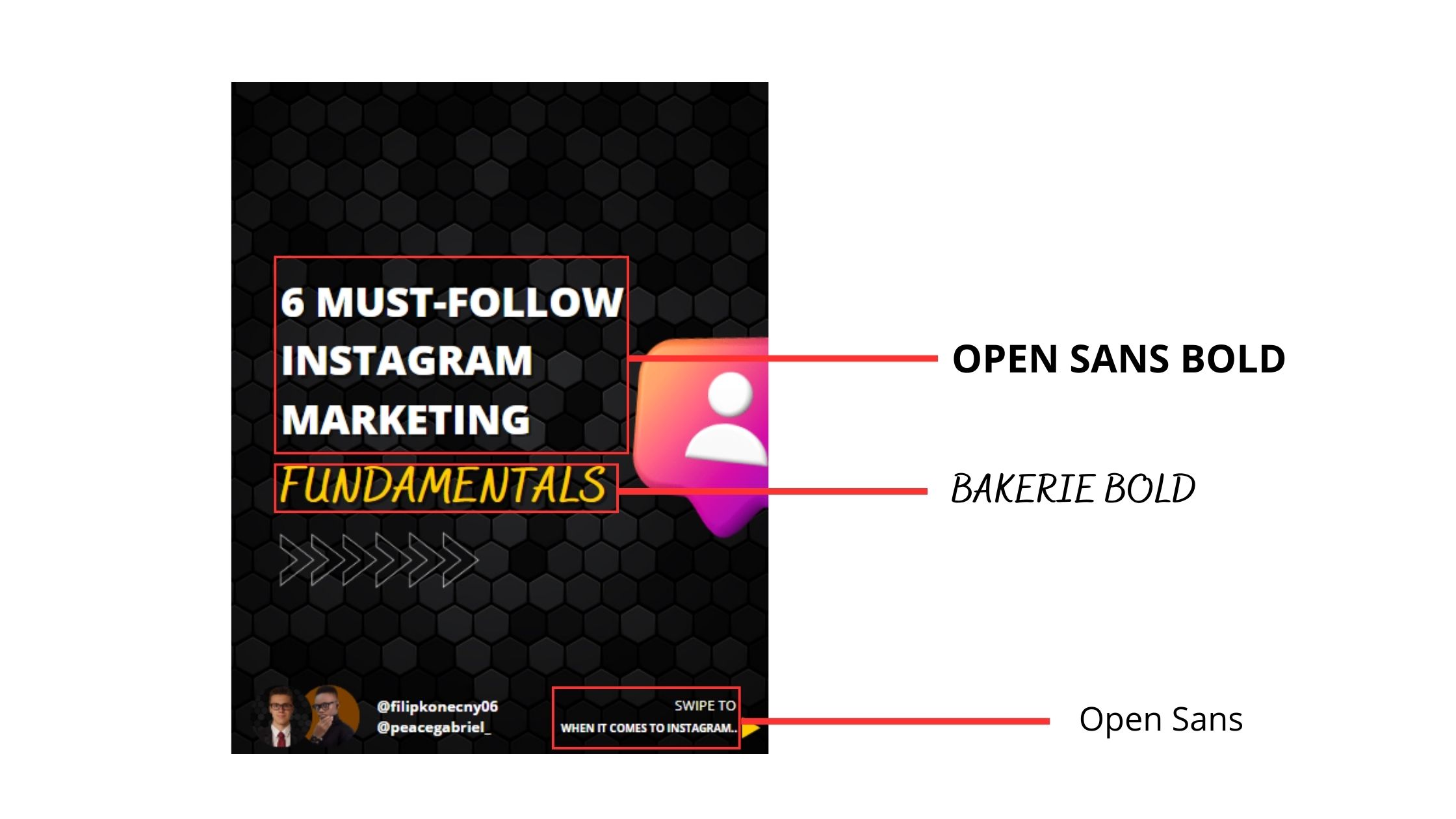
Typography is a key element in conveying your brand’s personality, enhancing visual appeal, and creating a consistent brand identity.
Here’s how you can discover the perfect typography for your brand on Instagram.
First, it’s important to understand your brand identity. Take a moment to reflect on your brand’s values, target audience, and the message you want to convey. Is your brand more modern and minimalistic, or is it playful and whimsical?
Understanding your brand’s personality will guide you in choosing typography that aligns with your brand identity.
Consider your brand voice and tone as well. Think about the emotions and attitudes you want to evoke through your content. Is your brand friendly and approachable, or is it more formal and sophisticated?
The typography you choose should reflect and reinforce your brand’s voice.
Legibility is a crucial factor to consider, especially on a visual platform like Instagram. Make sure the typography you select is easy to read, even at smaller sizes. Pay attention to letter spacing, font weight, and style.
Testing different fonts by typing out sample text can help you evaluate legibility and ensure that your audience can read your captions and messages clearly.
Now it’s time to do some research and explore different fonts. There are countless fonts available, so take the time to browse font libraries and websites.
Experiment with various font styles and consider both free and paid options. Look for fonts that resonate with your brand’s personality and align with your aesthetic preferences.
Font pairing is another important consideration. Choose two or three fonts that complement each other and create visual harmony.
Typically, a combination of a headline font and a body font works well. Make sure the fonts have contrasting characteristics to create distinction and hierarchy in your content.
Ensure that your typography aligns with the overall visual elements of your brand, such as your logo, color palette, and imagery.
Consistency across all aspects of your brand will strengthen brand recognition and create a unified brand identity. Your typography should blend seamlessly with the other visual components.
Testing and iteration are crucial steps in the process. Test your chosen typography across different devices and screen sizes to ensure it remains legible and visually appealing. Experiment with font sizes, styles, and placements to find the optimal combination.
Pay attention to audience feedback and engagement to gauge the effectiveness of your typography choices, and be open to making adjustments if necessary.
Finally, create a style guide to document your typography choices. Include the names or sources of the fonts, specific font styles (regular, bold, italic), and guidelines for usage.
This style guide will serve as a reference for you and your team, ensuring consistency in typography across all your Instagram content.
Alright, I hope you found this article helpful, and if you want to truly discover how to grow your business and make money on Instagram…
Join The Build Your Instagram
Empire Course Today
Join The Build Your Instagram Empire Course For Just $50 And Discover A Secret System For Growing A Giant Following, Reaching Millions Of People, And Selling Anything To Anyone Using Instagram Without Having Years Of Marketing Skills Or A Jumbo Ad Budget!
