
An email marketing portfolio can open doors fast, but only if it proves more than taste. Pretty screenshots help, but they are not enough on their own anymore. A serious portfolio has to show that you can think like a strategist, write like a marketer, build like a producer, and measure like someone who understands what the inbox is worth to a business.
That bar is higher because email is still one of the most commercially durable channels in digital marketing. Litmus continues to document strong email ROI, HubSpot still places email among the best ROI channels for B2C brands, and current benchmark sets from the DMA, Mailchimp, and Brevo all keep normal campaign performance in the same serious commercial range, with opens broadly in the 30s and click-through performance in the low single digits. So when someone reviews your work, they are not just asking whether you can make an email look polished. They are asking whether you can help a company earn attention in the inbox and turn that attention into measurable action.
That is why a weak portfolio feels empty so quickly. It looks like a gallery when it should feel like evidence. A strong email marketing portfolio shows the business problem, the audience logic, the creative decisions, the technical execution, and the performance story in a way that makes your judgment obvious before anyone even books a call.
Article Outline
- Part 1: Why an Email Marketing Portfolio Matters
- Part 2: Framework Overview
- Part 3: Core Components
- Part 4: Professional Implementation
- Part 5: Analytics and Performance Proof
- Part 6: Portfolio Ecosystem and FAQ

Why an Email Marketing Portfolio Matters
An email marketing portfolio matters because the job itself got more demanding. Gmail now requires stronger sender practices for bulk mail, including authentication and one-click unsubscribe, while Yahoo continues to push senders toward low complaint rates and cleaner list hygiene. At the same time, accessibility moved out of the “nice to have” category after the European Accessibility Act took effect on June 28, 2025, and email-specific guidance from Validity, Customer.io, and Litmus now treats accessible email design as operational work, not decoration.
That changes what people need to see when they evaluate you. They do not just want proof that you can arrange blocks, buttons, and product tiles. They want proof that you understand how email actually works when real subscribers, real mailbox providers, and real business goals get involved.
A good portfolio also reduces the trust gap. Clients and hiring teams usually cannot see your inside-the-account work, your QA process, or the conversations that shaped the final send. Your portfolio bridges that gap by translating hidden work into visible judgment, which is exactly what makes it easier to win projects, interviews, and better fees.
The smartest portfolios also recognize that measurement changed. Salesforce’s latest State of Marketing research, Customer.io’s 2025 lifecycle findings, and Iterable’s breakdown of how Zwift evaluates email all point in the same direction: opens and clicks still matter, but they are no longer the whole story. The real value sits in whether the program improves trust, conversion, retention, and revenue without damaging deliverability.
Framework Overview
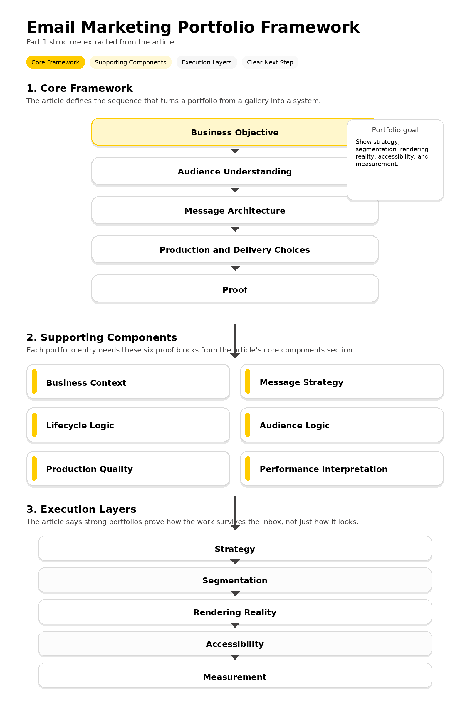
The cleanest way to build an email marketing portfolio is to think in layers. Start with the business objective, move into audience understanding, show the message architecture, explain the production and delivery choices, and then close with proof. When you use that order, your work stops feeling like a random collection of sends and starts feeling like a system.
That framework matches how serious teams run email in the real world. Mailchimp’s strategy guidance and segmentation resources frame email as a channel built on planning and audience logic, while Braze’s automation examples and behavior-based messaging guidance show how modern programs respond to actions, milestones, and lifecycle timing rather than blasting the same message to everyone. On the delivery side, resources from Brevo, Mailjet, and Postmark keep reinforcing the same point: execution quality affects whether the work reaches the inbox at all.
This is where many portfolios fall apart. They show the message, but not the logic behind the message. A better framework makes each project answer a few obvious questions: what was the goal, who was it for, why was it structured this way, how was it built to survive the inbox, and what happened after it went live?
It also helps you present stronger creative work. Litmus client-share data is a constant reminder that email lives inside multiple environments, not one perfect canvas, so a portfolio should show that you can think beyond a static mockup. When your framework includes strategy, segmentation, rendering reality, accessibility, and measurement, your portfolio starts sounding like the work of a professional operator instead of a designer with screenshots.
Core Components
A strong email marketing portfolio needs a few components every time, even if the project itself was small. The exact visuals can change, the brand can change, and the format can change, but the underlying proof should stay consistent. That is what makes your portfolio feel credible instead of improvised.
- Business context: Explain the commercial goal, the audience segment, the offer, and the constraint that shaped the send. Without that, nobody can tell whether the work was actually strategic.
- Message strategy: Show how the subject line, preheader, hierarchy, and call to action were chosen. This is where you prove that your copy decisions were intentional rather than decorative.
- Lifecycle logic: Include whether the asset was a campaign, a welcome sequence, a win-back flow, a browse-abandonment message, or something else. Email is stronger when people can see where the send belongs in the customer journey.
- Audience logic: Show segmentation, personalization, or behavioral triggers when they mattered. Guidance from Mailchimp, Customer.io, and Braze all reinforce how much smarter email gets when it stops treating the whole list as one audience.
- Production quality: Include notes on responsive behavior, accessibility choices, QA, and deliverability considerations. That layer has become too important to hide, especially now that mailbox-provider requirements and accessibility standards shape what “good” email work actually means.
- Performance interpretation: Show what moved, what did not, and what you learned. A portfolio becomes much more convincing when it explains the result instead of just dropping a metric and moving on.
The important thing is that these components work together. A screenshot without audience logic is weak. A metric without context is weak too. But when you connect strategy, structure, execution, and outcome, even a simple project can suddenly look like the work of someone who understands how email contributes to growth.
Professional Implementation
Once you know what to include, the next step is packaging it like someone worth hiring. Every project in your email marketing portfolio should read like a compact case study: the challenge, the audience, the approach, the execution, and the result. That format respects the reader’s time and makes your thinking easy to follow, which matters because decision-makers often skim first and only slow down when something feels sharp.
You also want your portfolio to feel alive, not archived. In practice, that means pairing visuals with explanations, showing annotated snippets when needed, and giving readers a sense of how the email connected to a real funnel or lifecycle path. For the live layer, some marketers build the front-end path in ClickFunnels or Systeme.io, then run forms and campaigns through an email platform such as Brevo or Moosend so prospects can see the signup flow, confirmation experience, and follow-up emails working together instead of sitting as isolated images.
Professional implementation also means choosing what not to show. Do not overload the page with ten nearly identical promotions, and do not hide weak reasoning behind fancy layouts. A tighter portfolio with clear business logic, clean presentation, and a strong next step usually performs better than a giant gallery, especially when that next step makes it easy for a prospect to contact you, request a sample audit, or book a conversation.
Most of all, make the portfolio easy to trust. If you use protected work, say what you can and cannot reveal. If metrics are directional because of privacy changes, say that clearly. That level of honesty makes your portfolio feel more senior, and in email marketing, senior judgment is usually what people are really paying for.
The Framework Behind a Strong Email Marketing Portfolio
The easiest way to make an email marketing portfolio feel valuable is to stop treating it like a gallery. It needs a clear structure that shows how you think before the email is written, how you build once the strategy is set, and how you judge the result after the campaign or automation goes live. That approach lines up with what Salesforce’s latest State of Marketing research, Mailchimp’s guidance on segmentation, Braze’s work on behavioral marketing, and Customer.io’s lifecycle email framework all point toward: better email work comes from relevance, timing, and execution working together.
That is the real framework to follow. Start with the business problem, move into audience and lifecycle logic, make the production layer visible, and then end with proof that shows what happened and what you learned. When those pieces are in the right order, your email marketing portfolio feels like the work of someone who can actually run the channel, not someone who only knows how to decorate it.
Start With the Business Problem Before You Show the Creative
Every strong framework starts with the reason the email had to exist in the first place. Was the goal to activate new subscribers, rescue abandoned carts, drive a product launch, re-engage quiet customers, or move loyal buyers toward a second purchase? When you begin there, the reader immediately understands what success was supposed to look like, which makes every creative and technical choice easier to judge.
This matters even more now because marketing teams are under pressure to create more relevant, more personal communication without losing control of the data behind it. Salesforce’s current report makes that tension very clear, and Adobe’s latest digital trends research points to the same bottleneck: brands want more personalization, but fragmented data still gets in the way. A good email marketing portfolio should show that you know how to turn a messy business objective into a focused email job to be done.
That is why the first block in each portfolio example should be a short business brief, not a hero image. Give the reader the objective, the audience, the offer, and the main constraint. Once those are clear, the email itself stops looking like a design exercise and starts looking like a strategic response to a real business problem.
Map the Audience, Trigger, and Lifecycle Moment
The second layer of the framework is where many portfolios either become persuasive or fall flat. If you cannot explain who the message was for, why they received it, and what stage of the relationship they were in, the work feels generic no matter how polished it looks. A serious email marketing portfolio makes that logic visible by naming the segment, the trigger, and the lifecycle moment behind the send.
That structure reflects how modern email programs are actually built. Mailchimp’s segmentation guidance keeps pushing marketers away from sending the same message to everyone, Customer.io shows how lifecycle emails become stronger when they match behavior and journey stage, and Braze’s behavioral segmentation material reinforces the same idea from the customer engagement side. In other words, the framework for your portfolio should prove that the email belonged to a system, not that it simply existed.
That is also where you can make your judgment stand out. Explain why a welcome email needed one tone while a win-back email needed another. Explain why the trigger came from a product view, a purchase gap, a signup source, or a preference signal. When you do that well, your email marketing portfolio starts communicating strategic maturity without having to say the words out loud.
Make the Production Layer Visible Instead of Hiding It
A lot of people still present email as though the mockup is the finished work. It is not. The real work includes deliverability, rendering, accessibility, testing, link behavior, and all the practical details that determine whether the subscriber sees the email the way you intended. If your portfolio hides that layer, it hides some of the most valuable work you did.
That production layer matters because the inbox got stricter. Google’s sender guidelines require qualifying bulk senders to support one-click unsubscribe for marketing mail, Postmark’s deliverability guidance warns that the domains and URLs inside a message can affect trust and inbox placement, and Litmus’ current testing playbook treats testing as part of the full creation process rather than a last-minute box to tick. That means an email marketing portfolio should show the messy-but-important layer where professional standards live.
Accessibility belongs here too, and it deserves more than a throwaway mention. The European Accessibility Act took effect on June 28, 2025, while Litmus’ accessibility guidance keeps emphasizing semantic headings, thoughtful ALT text, and code choices that help screen readers navigate the message. So if you want your email marketing portfolio to feel professional, show the QA notes, the accessibility decisions, the rendering checks, and the send-readiness steps that made the final email trustworthy.
Rendering reality also needs to be part of the framework because subscribers do not open email in one perfect environment. Litmus’ current client-share view still shows Apple as the largest source of tracked opens, and the same source explains that Apple Mail totals include privacy-impacted opens after Mail Privacy Protection. That is exactly why a strong portfolio should not pretend the inbox is simple. It should show that you understand how email behaves in the wild.

End With Proof, Judgment, and a Clear Next Step
The final layer of the framework is proof, but proof should never be reduced to a random metric dropped at the end of the page. A better move is to explain what metric mattered most for that specific job, what happened after launch, and what you would optimize next. That makes your email marketing portfolio feel thoughtful because it shows that you know how to interpret performance, not just report it.
This is especially important because email measurement is no longer as clean as many people wish it were. Litmus’ explanation of privacy-impacted opens is a good reminder that raw opens can be misleading, while the broader direction of current marketing research keeps pulling teams toward stronger data use, sharper personalization, and better downstream outcomes. So the framework should push you to talk about the right evidence for the job, whether that means clicks, submissions, purchases, activation, retention, or a cleaner signal deeper in the funnel.
It also helps to end each case study with a simple action path for the person reading your portfolio. If they like your thinking, they should be able to move naturally into a sample audit request, a discovery call, or a quick project inquiry. Some marketers make that handoff visible with a form built in Fillout, then route qualified prospects to a booking step through Cal.com, which can make the journey from interest to conversation feel just as intentional as the email systems they are trying to sell.
That is the framework in its cleanest form. Start with the problem, map the audience and trigger, reveal the production layer, and finish with proof plus a clear next step. When you build your email marketing portfolio that way, every project works harder because it tells a complete professional story instead of showing only the finished surface.
Core Components of an Email Marketing Portfolio

If you want your email marketing portfolio to win trust fast, every portfolio entry needs a few core pieces that do real work. The goal is not to impress people with volume. The goal is to make it painfully obvious that you understand the strategy, the build process, and the business outcome behind the email they are looking at.
That matters because email is no longer judged only by whether it looks good in a mockup. Google’s sender rules, the bulk-sender threshold Google defines at roughly 5,000 messages per day, current accessibility guidance from Litmus, and Litmus’ running view of email client market share all point to the same reality: professional email work now lives at the intersection of copy, design, code, testing, deliverability, and measurement. So your email marketing portfolio has to show more than the finished send. It has to show the thinking that made the send worth opening, clicking, and trusting.
Strategic Context Comes First
The first core component is strategic context. Before anyone looks at a screenshot, they should know what the email was supposed to do, who it was for, and why it existed at that exact moment in the customer journey. That could mean a welcome sequence, a launch campaign, a post-purchase follow-up, a reactivation push, or a behavior-triggered email tied to browsing, buying, or dropping off.
This is where a lot of weak portfolios break apart. They jump straight into visuals and never explain the business tension behind the work. A stronger email marketing portfolio starts with a compact brief that names the goal, the audience segment, the offer, the trigger, and the main constraint, especially because Mailchimp’s segmentation guidance, Braze’s behavioral segmentation framework, Braze’s behavioral marketing guidance, Salesforce’s latest marketing research, and Adobe’s 2025 data and personalization report all keep circling the same truth: relevance depends on better audience logic, not just better design.
- Business goal: Explain whether the email was meant to drive revenue, activation, retention, signups, bookings, or something else.
- Target segment: Show who received it and why they qualified for that message.
- Lifecycle moment: Make it clear whether the message was part of onboarding, nurture, promotion, renewal, or win-back.
- Key constraint: Mention the limitation that shaped the work, such as brand rules, time pressure, weak data, or deliverability risk.
Once that context is in place, everything else in the portfolio entry becomes easier to trust. The subject line stops looking random. The structure of the email stops feeling cosmetic. And the reviewer can finally judge your decisions against the job the email had to do.
Creative Assets Need Production Proof Behind Them
The second core component is the creative layer, but not in the shallow way people usually present it. Yes, you should show the email itself. You should also show why the hierarchy, copy, call to action, personalization, and layout were built the way they were, because in email, presentation and performance are tied together much more tightly than people think.
This is also where your email marketing portfolio can separate you from someone who only knows how to make a nice mockup. Mailchimp’s documentation on HTML email limitations is a reminder that inboxes still have real technical constraints, email client share data from Litmus shows how many different rendering environments your work has to survive, and Mailchimp’s accessibility guidance plus Litmus’ 2025 accessibility guide make it clear that readable structure, ALT text, contrast, and screen-reader friendliness are not side issues anymore. They are part of the craft.
- Final creative: Include clean screenshots or a live recreation of the email.
- Copy rationale: Explain the thinking behind the subject line, preheader, body copy, and CTA language.
- Personalization and segmentation: Note where the message changed by audience, behavior, product interest, or engagement level.
- Accessibility choices: Mention live text, ALT text, contrast, semantic structure, and other usability decisions where they mattered.
- Testing and rendering: Show that the email was checked across devices and inbox environments instead of being designed for a single perfect screen.
If the portfolio piece included the path before or after the email click, it helps to name that too. For example, you can show that the opt-in page or post-click step was built in ClickFunnels or Systeme.io, while the message itself was managed through a platform such as Brevo or Moosend. That makes the work feel more real because it shows the email as part of a functioning system, not a disconnected asset floating on its own.
Results Matter Most When You Explain Them Well
The third core component is proof, but proof only becomes persuasive when it is interpreted. Anyone can drop an open rate or click rate into a portfolio and hope it sounds impressive. A better email marketing portfolio explains what metric actually mattered for that project, what moved, what did not, and what you learned from the result.
That kind of explanation matters because benchmarks are useful, but they do not tell the whole story on their own. Mailchimp’s benchmark tables, Brevo’s 2025 benchmark report built on more than 44 billion emails, and Constant Contact’s current benchmark roundup all reinforce the same practical point: opens often land in the low-to-mid 30% range for broad email programs, while clicks are usually much harder to win. That gap is exactly why a portfolio should show how your email was meant to move someone from attention to action, not just whether it got glanced at in the inbox.
Measurement also needs more honesty now than it used to. Litmus notes that Apple Mail opens include privacy-impacted activity under Mail Privacy Protection, and Braze’s recent guidance on open-rate analysis makes the same point in practical terms: open data is still useful directionally, but it should not be treated as the whole truth. So when you present results, make room for the deeper signal, whether that is click-through rate, conversion rate, purchase rate, activation rate, retention, or a stronger downstream business outcome.
- Primary KPI: Name the one metric that best matched the goal of the campaign or flow.
- Supporting metrics: Add opens, clicks, unsubscribes, bounce data, or revenue only when they help explain the story.
- Interpretation: Explain why the result was good, weak, surprising, or incomplete.
- Next-step thinking: Show what you would test next, because that proves you understand optimization rather than one-off execution.
This is also the right place to mention deliverability safeguards when they shaped the outcome. Google’s sender requirements and Postmark’s current domain warm-up guidance both make it clear that authentication, steady sending patterns, and list hygiene affect whether your work even reaches the inbox. When your email marketing portfolio shows the result and the operational discipline behind the result, it stops looking like a highlight reel and starts looking like proof that you know exactly what you are doing.
Statistics and Data

Numbers are where an email marketing portfolio either becomes believable or falls apart fast. Anyone can drop in a polished screenshot and call it a case study. What separates real professionals is their ability to show the data cleanly, explain what matters, and prove they know the difference between a healthy signal and a vanity metric.
That matters because the current benchmark landscape gives you a useful range, not a magic target. Brevo’s 2025 benchmark, built on more than 44 billion emails, reports a 31.22% overall open rate and a 3.64% click-through rate, while GetResponse’s current benchmark set reports 39.64% opens and 3.25% click-throughs, and Braze’s summary of the 2025 DMA benchmarking report places typical B2B opens around 37.4% and B2C opens closer to 40%. So if your email marketing portfolio says a campaign hit a 34% open rate, that number means almost nothing until you explain the audience, the list quality, the campaign type, and the buying context behind it.
A strong statistics section solves that problem. It does not drown the reader in dashboards. It gives the right numbers, in the right order, with enough explanation that a client or hiring manager can see your judgment at work.
Use Benchmarks to Add Context, Not Noise
The best way to use statistics in an email marketing portfolio is to frame performance, not to flex random percentages. Benchmarks are there to show whether a result was ordinary, unusually strong, or misleadingly weak on the surface. Once you use them that way, your portfolio starts reading like analysis instead of self-promotion.
This is why every portfolio entry should name one primary success metric and only a few supporting ones. If the job of the email was to drive purchases, conversion rate and revenue matter more than vanity engagement. If the job was to wake up a cold segment, then clicks, site return rate, and unsubscribe behavior might tell a more useful story than opens on their own.
- Primary KPI: Show the one number that best matched the objective of the campaign or automation.
- Supporting KPIs: Add only the extra metrics that help explain the result clearly.
- Benchmark context: Compare your result with a current industry or regional range when it genuinely helps the reader judge the outcome.
- Business meaning: Explain why the number mattered instead of assuming the reader will know.
That last point is where most portfolios go wrong. They throw data at the reader and never translate it into a business conclusion. A stronger email marketing portfolio makes the reader feel the result, whether that means stronger conversion, cleaner retention, healthier list quality, or better efficiency across the funnel.
Clean Measurement Matters More Than Inflated Reporting
You also have to be brutally honest about how email data works now. Open rates are still useful, but they are no longer clean enough to stand alone, especially when Apple devices are involved. Mailchimp explains that Apple Mail Privacy Protection inflates opens and open-related metrics, and Brevo notes that since February 6, 2025, its open-rate calculation includes system-detected opens such as Apple MPP and, since July 8, 2025, bot activity unless those signals are filtered out.
That is not a minor detail. It changes how you present success in your email marketing portfolio. If you show a dashboard screenshot without explaining whether Apple MPP or bot activity was filtered, the reader has no idea whether the open data is clean, inflated, or partially distorted. The safer move is to be direct, name the filter logic, and shift the spotlight toward clicks, conversions, revenue, retention, or another downstream action when that gives a truer picture.
Client mix makes this even more important. Litmus’ January 2026 client-share report shows Apple at 46.56% of tracked opens and Gmail at 25.45%, which means mailbox behavior and privacy mechanics influence a huge share of the data you see. A professional portfolio does not pretend measurement is perfect. It shows the number, explains the caveat, and then tells the reader what decision came out of that imperfect data.
Deliverability Data Belongs in the Portfolio Too
Most weak portfolios stop at opens and clicks. Strong ones go further and show whether the sender was protecting inbox placement while chasing performance. That matters because deliverability is not a side issue anymore. It is part of the job.
Google’s sender guidelines require all senders to meet baseline standards, and for anyone sending more than 5,000 messages per day to Gmail accounts, Google says the sender must use SPF, DKIM, and DMARC, keep spam rates below 0.30%, and support one-click unsubscribe for marketing mail. Google’s FAQ goes even further and says spam rate is calculated daily, that senders should stay below 0.1%, and that rates at or above 0.3% create a stronger negative delivery impact. That is exactly why your email marketing portfolio should not hide unsubscribe rate, spam complaint rate, hard bounces, soft bounces, and list-health signals.
Braze’s 2025 metrics guide also pushes marketers to watch spam report rate, unsubscribe rate, open rate by domain, and click rate by domain because those metrics reveal reputation problems and mailbox-specific friction far faster than a single blended performance number. In practical terms, that means your portfolio becomes much more persuasive when it shows not only that people engaged, but that the program stayed healthy while they engaged.
- Spam complaint rate: This shows whether the email was welcomed or resented.
- Unsubscribe rate: This helps reveal whether the message frequency, targeting, or promise was off.
- Bounce rate: This gives the reader a clear signal about list hygiene and data quality.
- Domain-level performance: This can uncover whether Gmail, Apple, Yahoo, or Outlook users experienced the email differently.
When those numbers appear in a portfolio entry, the work feels immediately more senior. You are no longer showing that you can send email. You are showing that you can manage risk while making email perform.
Turn Data Into a Decision Story
The smartest way to present statistics is to connect them to a decision. A portfolio entry should not end with a dashboard screenshot and a proud sentence. It should show what the data changed. Maybe the subject line did its job, but the click-through rate exposed weak offer clarity. Maybe the conversion rate was healthy, but complaint rates showed that the segment had been pushed too hard. Maybe Gmail performed fine while Apple-heavy audiences needed a cleaner layout and more obvious hierarchy.
That is what makes an email marketing portfolio feel valuable to someone who may hire you. They are not buying the past result by itself. They are buying the judgment behind the next result. So when you show statistics, always close the loop by stating what you learned, what you would test next, and how the numbers shaped the next move.
This is also where your tech stack can make the story feel more concrete. If the lead capture path was built in ClickFunnels or Fillout, and the email automation plus reporting lived in Brevo or Moosend, say that briefly when it helps the reader understand the measurement environment. It makes your portfolio feel less like theory and more like the work of someone who knows how the whole machine fits together.
That is the real goal of the data section. Not bigger screenshots. Not louder percentages. A better email marketing portfolio uses statistics to prove that you can measure what matters, interpret it honestly, and turn it into smarter marketing decisions.
Analytics and Performance Proof
This is the point where an email marketing portfolio either earns trust fast or starts to feel like theater. Screenshots can get attention, but proof is what closes the gap between “this looks good” and “this person knows how to grow a business with email.” That gap matters because Litmus’ 2025 ROI breakdown shows that 35% of marketing leaders report returns between $10 and $36 for every $1 spent on email, 30% report $36 to $50, and 5% report more than $50, while the same research also shows that 21% still do not measure email ROI at all.
That is exactly why your email marketing portfolio has to do more than show activity. It has to show whether the email changed something meaningful. When the proof is clear, your work feels commercial, not just creative, and that is what clients and hiring teams are really looking for.
Move Beyond Basic Engagement Metrics
The first rule of performance proof is simple: do not act like opens and clicks tell the whole story. They still matter, but they are no longer clean enough to carry the entire argument on their own. Mailchimp’s Apple Mail Privacy Protection guidance explains why Apple MPP distorts open-related metrics, and Litmus’ January 2026 client-share report shows Apple at 46.56% of tracked opens and Gmail at 25.45%, which means a huge share of your reported engagement is shaped by client behavior, privacy features, and image caching before a marketer even starts interpreting the numbers.
So in a strong email marketing portfolio, engagement metrics should be framed as the start of the story, not the conclusion. A healthy open rate can tell you the subject line did its job. A healthy click rate can suggest the message and offer were aligned. But the proof gets much stronger when you connect those signals to activation, purchase, retention, booked calls, qualified leads, or whatever business result the email was supposed to influence.
Braze’s current guide to email metrics pushes teams toward conversion, retention, and deeper customer impact for exactly this reason. If your portfolio still treats opens as the headline and everything else as a footnote, it feels dated. If it shows how engagement translated into business movement, it feels like the work of someone who understands what matters now.
Build a Clean Attribution Trail From Email to Outcome
The second layer of proof is attribution. If a reviewer cannot see how the click was tracked, where the user landed, and how the conversion was recorded, your result feels softer than it should. A better email marketing portfolio makes that path visible so the reader can see the chain from send to session to outcome.
Google Analytics explains that UTM parameters let you identify which campaigns refer traffic, and Google’s traffic-source documentation confirms that manually tagged parameters populate reporting dimensions in Analytics. That matters because a clean portfolio entry can show that the campaign used disciplined naming, consistent tagging, and a reporting view that matched the actual objective of the email. It sounds simple, but it is one of the clearest signals that the person behind the work knows how to measure beyond the inbox.
The opposite is true too. Google Analytics warns that incomplete or incorrect manual tagging can create “not set” values in reports, which is exactly the kind of silent mess that makes performance look fuzzier than it really is. So when you present a result in your email marketing portfolio, it helps to say whether the campaign used tagged links, whether the landing page path was tracked in GA4, and whether the conversion event was captured cleanly.
This is also where your stack can make the story feel much more real. If the opt-in or offer page lived in ClickFunnels, the form handoff ran through Fillout, the emails were sent with Brevo or Moosend, and the follow-up lived in a CRM like Copper, say that briefly when it helps the reader understand the reporting chain. Good proof is easier to trust when the mechanics behind it are visible.
Show Incremental Impact, Not Just Recorded Activity
The strongest portfolios go one level deeper and try to answer a harder question: what changed because the email happened, not merely after it happened. That is where incrementality becomes powerful. Reported activity is useful, but controlled comparison is what makes the proof feel truly professional.
Customer.io’s holdout-test documentation explains that a holdout lets you measure the true impact of messages by comparing conversion rates between people who received the message and people who did not. That idea is incredibly valuable inside an email marketing portfolio because it moves the conversation away from surface engagement and toward causal lift. Instead of saying a welcome sequence produced conversions, you can show whether it produced more conversions than a credible non-send baseline.
That kind of thinking lines up with broader pressure inside marketing teams. CaliberMind’s 2025 attribution report notes that marketers are increasingly expected to report on revenue instead of engagement. The smartest email marketing portfolio entries reflect that shift by showing controlled tests, lift against a baseline, or at least a before-and-after comparison with enough context to make the interpretation fair.
You do not need a giant enterprise data team to present proof this way. What you need is discipline. If a flow was tested against a holdout, say so. If a campaign was compared with the previous version, say what changed and why that comparison is imperfect. The honesty itself makes the portfolio stronger because it proves you understand the difference between a clean test and a hopeful story.
Package the Proof So Decision-Makers Can Trust It
Once the measurement is solid, the last job is presentation. A hiring manager or prospect should not have to decode six screenshots and guess what matters. The proof should be packaged in a way that feels quick to read, easy to trust, and hard to argue with.
That becomes even more important when teams are already struggling with fragmented reporting. Customer.io’s 2025 lifecycle research found that 53% of marketers struggle with disconnected systems and 48% struggle to measure success clearly. A strong email marketing portfolio can quietly solve that confusion for the reader by presenting one clean chain: objective, measurement method, result, caveat, and next step.
- Objective: State the commercial job the email needed to do.
- Measurement method: Explain what was tracked, where it was tracked, and how the attribution path was built.
- Primary result: Lead with the business outcome that mattered most, not the loudest vanity metric.
- Caveat: Note privacy distortion, list-size limits, or attribution gaps when they affect interpretation.
- Next test: Show what you would optimize next so the proof feels like the beginning of smarter growth, not the end of a one-off send.
This is what makes an email marketing portfolio persuasive at the highest level. It stops being a collection of campaigns and becomes a body of evidence. And when your proof is presented that clearly, the reader is much more likely to believe that you can do the same kind of thinking inside their business, not just inside your portfolio.
If you want that final handoff to feel as polished as the proof itself, it helps to make the next step obvious. Some marketers turn a portfolio visit into a qualified inquiry with a simple intake form in Fillout and a scheduling path through Cal.com, which keeps the jump from interest to conversation clean. That kind of finish works because it matches the whole point of a strong portfolio: make the path from attention to action feel easy, intentional, and measurable.
The Portfolio Ecosystem Around Your Email Work
An email marketing portfolio should not live like a lonely gallery page. It works much better when it is part of a full client-acquisition ecosystem that shows how you think, how you execute, and how a prospect can move from curiosity to conversation without friction. That matters even more now because Litmus’ 2025 ROI research still shows email producing strong returns for many teams, while Mailchimp’s Apple Mail Privacy Protection guidance makes it clear that measuring those returns takes more care than it used to.
In practice, that means your email marketing portfolio should connect to the rest of your professional system. Some marketers pair the portfolio with a landing page in ClickFunnels or Systeme.io, qualify leads through Fillout, nurture follow-up in Brevo or Moosend, and book calls through Cal.com. When those pieces fit together, your portfolio stops being a brochure and starts acting like proof that you understand the entire marketing path, not just the email itself.

FAQ for a Complete Guide to an Email Marketing Portfolio
What should an email marketing portfolio include?
A strong email marketing portfolio should include more than screenshots. It should show the business goal, the audience segment, the lifecycle moment, the creative decisions, the production notes, and the result that mattered most. That structure makes your work feel credible because it mirrors how modern email programs are actually built, which is the same direction you see in guidance from Braze on email metrics, Mailchimp on segmentation, and Customer.io on holdout testing.
How many case studies should I put in my email marketing portfolio?
You do not need twenty case studies to look serious. Three to six strong examples are usually enough if they show range across campaign emails, automations, different lifecycle stages, and different business goals. A small portfolio with clear thinking almost always beats a giant collection of disconnected work, especially now that Litmus keeps emphasizing how hard ROI can be to prove cleanly.
Can I build an email marketing portfolio without paid client work?
Yes, but you need to be honest about what the work is. If you do speculative projects, teardown analyses, rebuilt flows, or sample campaigns for a fictional brief, label them clearly so the reader never feels misled. That honesty matters because trust is part of what makes an email marketing portfolio work in the first place, and in a channel shaped by consent rules like Mailchimp’s permission guidance and sender requirements from Google and Yahoo, trust is not a small thing.
Should I include open rates in my portfolio?
You can include open rates, but you should never present them like they tell the whole story. Mailchimp explains that Apple Mail Privacy Protection inflates opens and open-related metrics, while Litmus’ January 2026 client-share report shows Apple accounts for 46.56% of tracked opens, which means a large chunk of open data is shaped by privacy behavior rather than pure human intent. So if you use open rates in your email marketing portfolio, pair them with clicks, conversions, retention, or revenue so the reader sees a fuller picture.
What metrics matter most in an email marketing portfolio?
The most important metric is the one that matches the job the email was supposed to do. If the goal was revenue, show conversion and revenue; if the goal was activation, show activation; if the goal was re-engagement, show return behavior and downstream action. That mindset lines up with Braze’s 2025 email-metrics guidance and the broader pressure from CaliberMind’s 2025 attribution report, which shows marketers being pushed toward business impact instead of surface engagement.
Do I need to show deliverability knowledge in my portfolio?
Absolutely, because deliverability is now part of the craft, not a technical footnote. Google’s sender guidelines require authentication and make one-click unsubscribe mandatory for qualifying bulk senders, while Yahoo’s best-practices page requires bulk senders to authenticate with SPF, DKIM, and a valid DMARC policy. When your email marketing portfolio shows that you understand sender health, complaint risk, list quality, and unsubscribe behavior, your work feels immediately more senior.
Does accessibility belong in an email marketing portfolio?
Yes, and it belongs there more than ever. AccessibleEU notes that the European Accessibility Act came into effect on June 28, 2025, and practical email guidance from Mailchimp stresses logical structure, meaningful headings, readable contrast, and critical content in text rather than images. If your email marketing portfolio shows accessibility choices instead of hiding them, it signals care, professionalism, and awareness of where digital communication is heading.
Should I show live HTML emails, screenshots, or both?
Both is usually the smartest move. Screenshots help the reader see the visual hierarchy fast, but live or partially live recreations help prove that you understand how email behaves in the real world. That matters because Litmus client-share data is a constant reminder that people open email in very different environments, so a good email marketing portfolio should not pretend every message lives on one perfect screen.
How often should I update my email marketing portfolio?
Update it whenever your best thinking changes, not only when you finish a new project. That could mean replacing an older example with a sharper one, refreshing screenshots, improving the explanation around a result, or adding a stronger automation case study. You should also revisit it when the market shifts, because sender requirements from Google, best practices from Yahoo, and measurement realities shaped by Apple Mail Privacy Protection all affect how convincing your proof looks.
How do I protect confidential client data while still showing proof?
You can blur identifying details, remove customer data, show percentage lift instead of absolute revenue when needed, and explain that some metrics are directional for confidentiality reasons. What matters is being transparent about what you changed and why. A cleanly anonymized case study still works if the logic is clear, the attribution path makes sense, and the portfolio entry explains the decision-making with enough specificity to be trusted.
Can one email marketing portfolio help me win both freelance clients and in-house roles?
Yes, if you structure it around judgment instead of around personal branding alone. Clients want to know whether you can drive outcomes quickly, while hiring managers want to know whether you can think systematically and work inside a team. A strong email marketing portfolio can do both when it shows strategic context, production discipline, and performance proof instead of relying on pretty assets and bold claims.
What is the biggest mistake people make with an email marketing portfolio?
The biggest mistake is confusing aesthetics with evidence. A page full of beautiful emails can still feel weak if it never explains the audience, the lifecycle logic, the measurement method, or the result that mattered. In a channel where email still produces strong returns for many brands but many teams still struggle to prove that ROI clearly, the people who can explain performance calmly and credibly stand out fast.
What is the best next step after someone likes my portfolio?
Make the next step incredibly easy. If a prospect has to hunt for a form, guess what service you offer, or send a vague message with no structure, you lose momentum you already earned. That is why many marketers connect the portfolio to a simple intake flow in Fillout, a booking path through Cal.com, and a follow-up sequence in Brevo or Moosend, because the portfolio should move people toward action, not just admiration.
Work With Professionals
If you are serious about turning an email marketing portfolio into real opportunities, treat it like part of a working system instead of a static page. Give prospects a clear path to inquire, a clean way to book, and a follow-up process that proves you understand the channel you sell. The marketers who win more often are usually the ones who remove friction first.
That is also why the right tools can help your portfolio pull its weight. A landing page in ClickFunnels or Systeme.io, lead capture through Fillout, campaign delivery in Brevo or Moosend, and relationship tracking in Copper can turn your portfolio from a showcase into a pipeline asset. When that setup is tight, your email marketing portfolio starts working like your best salesperson.
Explore 10K+ Remote Marketing Contracts on MarkeWork.com
Most marketers spend too much time chasing clients, competing on crowded platforms, and losing a percentage of every project to middlemen.
MarkeWork gives you a better way. Browse thousands of remote marketing contracts and connect directly with companies desperate to hire skilled marketers like you without platform commissions and without unnecessary gatekeepers.
If you’re serious about finding better opportunities and keeping 100% of what you earn, you can explore available contracts and create your profile for free at MarkeWork.com.
